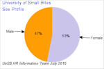
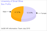
In reporting we can use simple text and some tabular data. This appeals to people who have a preference for numbers, logic and mathematical computations. At the most basic, level deliver this and you have produced a report.
To recognise the different preferences of audiences receiving our information we should also respect the fact that some people find that visual imagery and colour help them make sense of what they see. In this respect we include charts to help give further context to the information we are delivering.
In short we must remember that reporting is about conveying information and reports should do as much as possible to engage readers.
You will notice that we have used both 2D pie charts 
and 3D pie charts .
.
We credit CyberMick for reminding us that, whilst being pleasing to look at, 3D pie charts can distort the perceived size of each slice of the pie. We have included both forms of chart so that you can see the difference in the visual representation of the slices. For anyone interested in reading further on the case for being wary of 3D charts please visit the page linked below:
The Case Against 3D Charts in Dashboards
Being in charge of people's data is a very important responsibility and exceptional care must be taken over how it is used. In publishing profiles of an organisation it is important to mindful that no individual should be able to be identified from a public profile.
To avoid this it is important to only publish groupings that are above a certain minimum size. For example it might be agreed that areas will be aggregated so that all groupings contain more than 10 people.
From looking at our organisation chart you will see that for reporting purposes we have chosen to report on the top levels of the organisation. It is easily possible to publish information on smaller units but at some points the numbers become so small in teams that it is easily possible to identify private information on people. This must be avoided as in the UK it can breach data protection legislation
Creating charts from scratch requires a reasonable knowledge of mathematics, in particular geometry. Remember things like the size of a circle is proportionate to the square of its radius multiplied by π or the area of a rectangle is length x breadth?
It turns out that there is a use for those things.
If you loved geometry at school, and have a basic knowledge of programming, it is possible to produce your own library of charts for your own personal use.
If you don't want to spend the hundreds of hours it would take to make your own chart library then you can always use some charting software. This ranges from using the charts in a spreadsheet package to spending thousands of pounds on a licence for specialist charting software.
We started building a library and got as far as our own bar charts for displaying salary reviews  . Now we use the fantastic package pChart. If you do not have access to more expensive commercial charting packages then we can recommend pChart. You can visit the pChart website at http://www.pchart.net/.
The package is free if your use is not a commercial one (eg: you make no money by redistributing your work). We have found pChart really excellent for developing this free site.
The Employment Rights Act 1996 underpins contracts of employment in the United Kingdom.
The terminolgy to use is a written statement of particulars of employment. This summarises the main particulars of the employment relationship and must according to the legislation be given within two months of the person's first day of service.
Whilst the law states two months it would actually be poor form to encourage a person to give up an existing job or prior state of affairs without actually presenting them with the contractual terms of their new role until two months after it has started. The law is quite flexible but if we are truly focused on the quality of the engagement with the prospective member of staff the written statement of particulars really should be issued as soon as possible after the decision to appoint has been made.
Issuing the written statement of particulars at the earliest point means the person is aware of what they being contracted to and can clarify any uncertainties before accepting. Starting a relationship in this manner where possible helps ensure a more harmonious contract.
The key aspects of a written statement of particulars are as follows:
An explanation of the symbols used

|
This icon represents a unit that has child units. Click it to see the child units. |

|
This icon means that a unit has its child units visible. Click to close the child units. |
| Unit name | Click on a unit to get more information on it. If the unit has child units it will open a page showing them too. |

|
Clicking this icon takes you to some basic theory on organisation charts and structure. |

|
This button is Collapse All and when clicked closes all units that have been opened up. |

|
This button is Expand All and when clicked opens all units so you will see every aspect of the tree. |

Welcome to the free website for people who want to learn about the technology used for keeping staffing details in offices. Using this site you can learn as much from the comfort of your arm chair as you could in two years at work. Here is your chance to practice with systems that you may only have heard about. Get a behind the scenes view of what happens with your information and how it is stored.
This site is aimed at people from school leaving age and above who may be interested in working with what are known as Human Resources (HR) information systems.
If we can help even one person to secure a job in HR or specialise in HR systems as a result of using our free development site then the creators of HRMISolutions and Learning in Small Bites will have achieved what we set out to do.
You will get the best out of this site if you have:

Administrators will store a lot of information in systems. In this section we will work with some tools that can be used for getting information out and using it for management decisions.
There will be opportunities to try out some basic reporting and also to design some reports online. This will help administrators to become familiar with adding statistical information to their work and will hopefully take some of the mystery out of compiling statistics.
The table below helps show what information managers deal with.
| Reporting Historical | Analytics Historical | MonitoringCurrent | Prediction Future |
|---|---|---|---|
| What happened | Why it happened | Where we are now | What is likely to happen next |
The historical and current do not tell much more than what is going on at present. It is interesting to note that business leaders probably place highest value on being able to predict what will happen next.
Below are links to some pages for you to make your own example charts and also review ones we prepared earlier.